Furore x Raveel
Edition Five
For FURORE Edition Five, fashion and art are once again intimately entwined. This time, designer Elke Baert found inspiration in the oeuvre of Belgian painter Roger Raveel (1921 - 2013), whose birth centenary is currently being celebrated with comprehensive retrospectives at both BOZAR and the Roger Raveel Museum.
Like Magritte – who inspired The Limited Editions Two, Three and Four – Raveel looks at the landscape through a window. Whereas Magritte’s layers have double meanings, Raveel focuses on everyday objects and activities. Even though he detaches such elements from reality through the use of austere lines, vivid colours and abstract surfaces, they remain recognisable.
Furore designer Elke Baert also finds inspiration for her silhouettes and prints in the forms found in art, architecture and nature, as well as the subtle fluctuations of light and shadows. She transforms the play of lines that is created on paper into fabric and timelessly modern collections that radiate a feminine, unassailable power.
Furore x Raveel
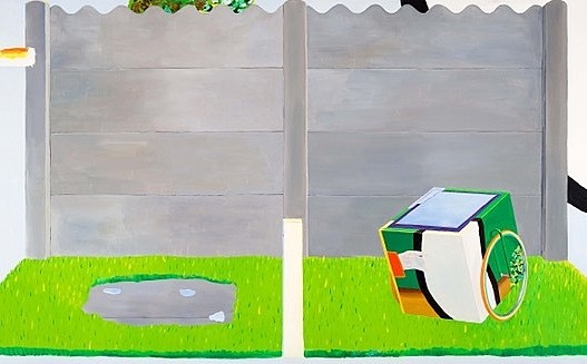
Garden with Cart to Transport the Sky (1971) is a consummate example of Roger Raveel’s recognisable style, which he maintained until the end of his life in Machelen-aan-de-Leie, home of the Roger Raveel Museum. The cart is a recurring theme in his work and even leaves the page at a certain moment in his career, acquiring real wheels for use in actions.
The mirror on the cart reflects the sky and carries the latter along, as it were. Not only Raveel, but also Magritte and the French artist Yves Klein were inspired by the sky. Gazing up at the clear blue heavens during a stay on the French Riviera, the latter said: “The blue sky is my first artwork”.
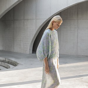
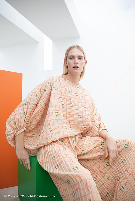
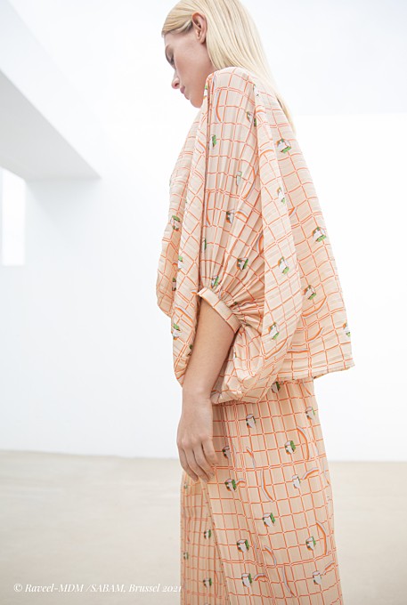
For Edition Five’s ‘The Limited’ collection, Elke Baert translates the renowned painting Garden with Cart to Transport the Sky into a lozenge pattern and abstracts the cart yet further. The tiny white squares that link the individual panes allude to the white plane, a central device in Raveel’s work that was inspired by a sheet on a washing line. Or to quote Raveel himself: “The white hole in reality, a mental space”.
The cart’s wheels are deconstructed to form intriguing linear arcs in blue and mandarin. Reducing things to their visual essence through a play of lines: a trait that is shared by both Roger Raveel and Elke Baert.
It is not for nothing that the Furore logo consists of a circle (for circularity) underscored with an explicit dash (like the start of a frame). Within the current context, the logo is a (un)knowing nod to the interplay of lines and the emphatic nature of Raveel’s cart. A balancing act between reality and abstraction, a play of light and shade, whether or not in a recognisable Flemish landscape.
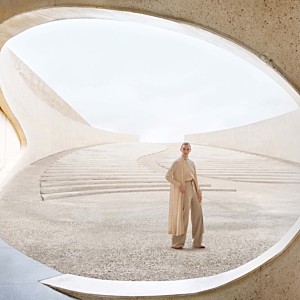
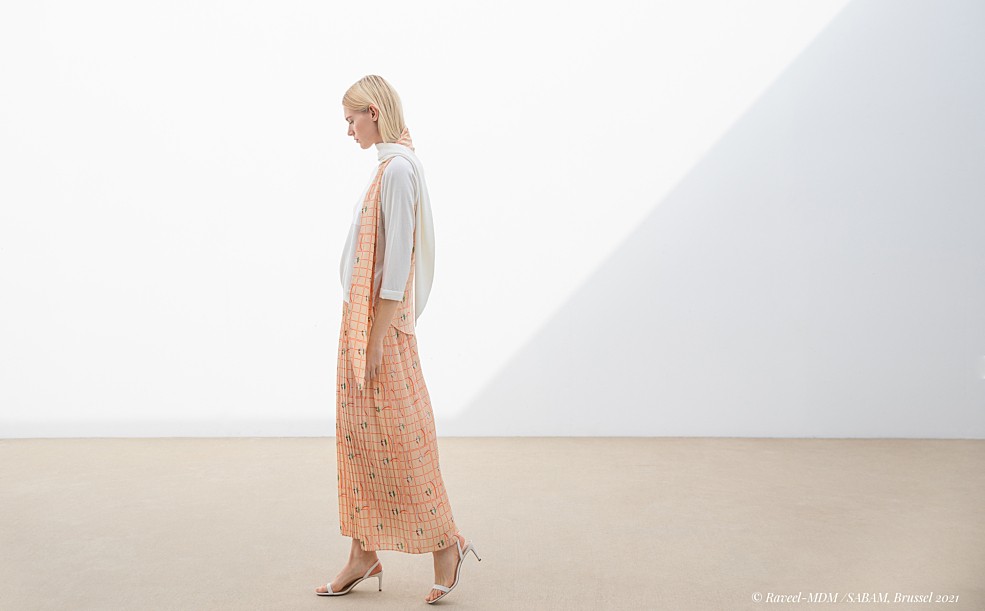
The dominant shade in the colour palette, mandarin, alludes to Raveel’s preference for vivid hues but, with its positive character, is also a homage to life. The FURORE Edition Five campaign images sublimely reinforce this image thanks in no small part to the experienced eye of the photographer, Klaartje Lambrechts, and the location, MUZE’UM L, Light and Longitude in Roeselare
A sustainable collection
Parallel to Raveel’s characteristic white square, both the circle and the colour white are central to Furore. White radiates peace, tranquillity and balance. From that quiet but unalloyed power, a colour palette emerges that can also be detected in the landscape and/or nature: from pastel shades – much in evidence in previous collections – to peripheral flashes of more intense hues.
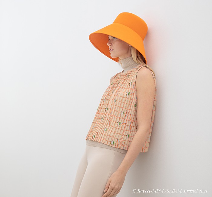
In ‘The Collection’ Edition Five, Elke Baert explores the more pronounced shades of mandarin, brown and blue, which not only appear in Raveel’s oeuvre but also form a seamless link with the brand’s first collection. From the bright green in the painter’s work, she traces a line back to the emerald green and pumpkin yellow that enlivened Edition One.
Building on previous editions – as a designer, but also as a consumer – is vitally important at Furore. The slow fashion brand aims to inspire women to give a new twist to their existing wardrobe. When you invest in timeless pieces and combine them with each other, you create your own style in a sustainable way. The rich colour palette of Edition Five is balanced by shades of ecru, white and grey.
The dominant shade in the colour palette, mandarin, alludes to Raveel’s preference for vivid hues but, with its positive character, is also a homage to life.
Just as Roger Raveel created volume and dynamism in paint, Furore creates layers by working with two different fabrics in a single garment. In other models, such as the Piado sweater, beautiful colour nuances are achieved by combining different shades of yarn.
The distinctive Furore diamond, that radiates a perpetual sense of austerity and calm, is now combined with light blue squares as a nod to the cart with the mirror that transports the sky. This is also the point at which reality and imagination converge.
Indispensable
In addition to the more outspoken items, several new models have also been added to ‘The Official’ or ‘Never Out of Stock’ collection. This range consists of essential garments that are always repeated: because why not cherish a garment with the perfect cut, in the perfect fabric, forever?